Introduction and Important Disclaimer
This analytical tool offers a data‑driven view of how a financial instrument might behave over a user‑defined holding period, drawing exclusively on historical price movements. By harnessing past return distributions and overlaying multi‑year seasonal trajectories, it provides a probabilistic framework for evaluating potential future price levels. However, it is crucial to understand that historical behavior does not guarantee future outcomes; unexpected market shifts, macroeconomic events, and structural changes can render past trends ineffective. Users should treat these insights as one input among many in their decision‑making process, rather than as a definitive forecast.
Historical Return Distribution Analysis
First, the system gathers closing‑price data over a specified look‑back window—ranging from one to twenty years—to build a comprehensive sample of past returns. For each trading day in that span, it computes the percentage change in price after a fixed number of holding days ahead (for example, 30, 60, or 90 days). These percentage changes are then re‑scaled to the most recent closing price to generate a set of hypothetical future prices. By aggregating these scenarios into a finely binned histogram, the tool reveals the empirical distribution of possible price outcomes, allowing users to see how often the instrument might end above or below various levels within the defined horizon.
Threshold‑Based Probability Modeling
To make the distribution immediately actionable, the analysis lets users specify one or two “break‑even” thresholds (for example, +2% or +5%). The histogram bars are color‑coded to distinguish outcomes falling below, between (if two thresholds are set), or above these critical levels. Embedded annotations display the exact probability (in percentage terms) of the price landing in each region, calculated simply as the fraction of historical scenarios exceeding or not reaching each threshold.
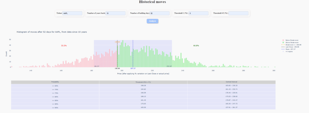
This approach transforms raw return data into intuitive odds, helping users gauge the likelihood of achieving desired gains or incurring drawdowns over the chosen holding period.
Statistical Annotations and Confidence Intervals
Beyond simple probabilities, the visualization incorporates key statistical metrics for deeper insight. It marks the current closing price, the historical mean of projected prices, and ±1 standard deviation bands—shaded directly on the histogram—to highlight the expected dispersion around the average outcome. Additionally, a summary table enumerates various confidence‑level thresholds (e.g., the price level that has a 90% chance of being exceeded) alongside their corresponding central intervals, offering a concise reference for risk‑reward assessment under differing confidence requirements.
Seasonal Trajectory Mapping
Complementing the probabilistic histogram, the tool overlays a line chart of seasonal price patterns by extracting sequences of daily returns starting on the current calendar date in each of the past years. Each historical trajectory is normalized to begin at today’s price and then plotted over the same holding‑period horizon, allowing users to visually compare how the instrument has historically unfolded over comparable time frames.
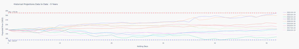
Horizontal lines mark the maximum and minimum of these seasonal projections, providing a quick gauge of best‑ and worst‑case historical scenarios. This multi‑year snapshot can uncover recurring strengths or vulnerabilities tied to specific times of year, enriching the probabilistic analysis with temporal context.
Reminder: All insights are derived from historical data and may not hold under future market conditions. Always consider additional factors—such as volatility, liquidity, macroeconomic indicators, and qualitative analysis—when making investment decisions.