Introduction and Important Disclaimer
This analytics module is designed to quantify how a security typically behaves immediately before and after its quarterly earnings announcements. By isolating a window of trading days leading up to each earnings date and extending a similar window afterward, the tool builds a rich dataset of pre‑ and post‑earnings price changes. Users must remember that past patterns around earnings events offer no guarantee of future performance; unexpected news, shifts in guidance, or broader market dynamics can alter outcomes dramatically.
Earnings Event Data Aggregation
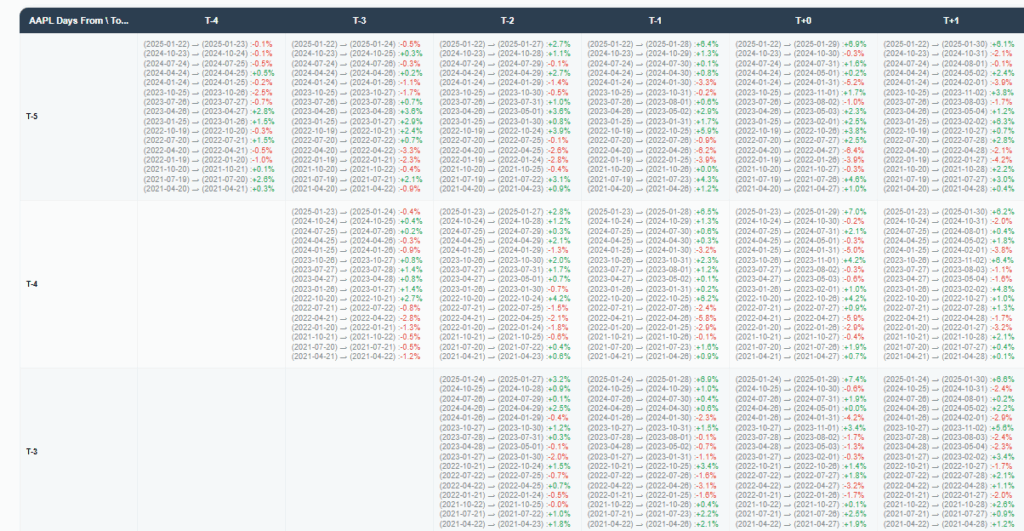
The system first compiles a history of recent earnings dates for the chosen ticker, up to a user‑defined number of quarters. For each earnings event, it identifies the closing price on the announcement day and steps backward and forward by a configurable number of business days. These data points form pairs of “entry” and “target” prices for every event, enabling the computation of the percentage move between any two offsets relative to the earnings release. The result is a three‑dimensional dataset indexed by earnings event, entry‑day offset, and target‑day offset.
Average Move Heatmap Visualization
To reveal the typical magnitude and direction of earnings‑related moves, the tool computes the mean and standard deviation of all percentage changes for each combination of entry and target offsets.
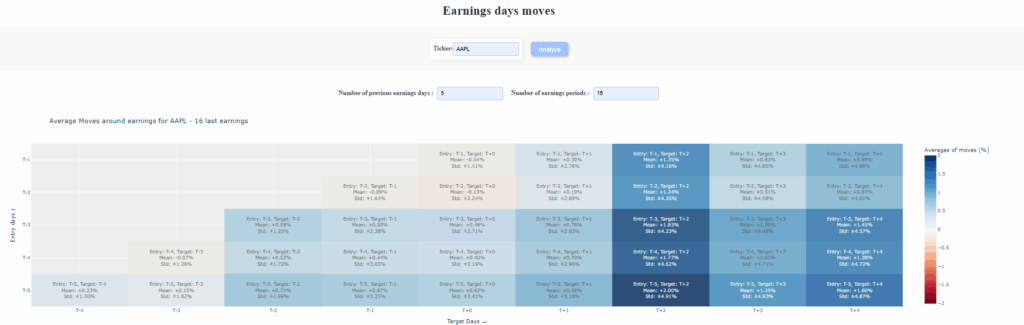
These summary statistics are rendered as a color‑coded heatmap, where rows correspond to days before earnings and columns to days around and after the announcement. Hover‑over details display the exact average move and its volatility, allowing users to quickly identify, for instance, whether prices tend to drift higher in the days preceding a report or experience heightened swings in the two days post‑release.
Individual Earnings Move Scatter Analysis
Beyond averages, the module offers a detailed scatter‑plot of every single earnings move for a chosen entry/target pair. Each point represents one quarter’s percentage change scaled to today’s closing price, color‑coded green for gains and red for losses.
Vertical and shaded bands demarcate common deviation thresholds (such as 68% and 75% confidence intervals), giving an intuitive sense of the typical spread of outcomes. This granular view helps users assess both the frequency and range of real past moves rather than relying solely on mean values.
Day‑by‑Day Evolution of Earnings Reaction
Finally, users can inspect full trajectories of price performance from a selected pre‑earnings day through a chosen post‑earnings offset. By normalizing each historical event to start at the latest closing price, the tool overlays multiple multi‑day curves on a single line chart.
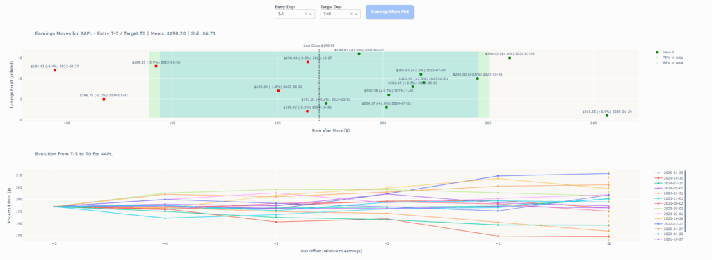
A vertical marker at the announcement day highlights the inflection point, while distinct curves for each quarter illustrate the consistency—or lack thereof—of earnings reactions over time. This chronology provides valuable context for understanding the timing and persistence of earnings‑driven moves.
Reminder: All analyses derive from historical earnings data and do not account for future surprises or structural shifts. Always combine these insights with forward‑looking research and risk management considerations.